V pátek 26. dubna 2024 úderem 22 hodiny začíná naše nová
a opravdu velká série soutěží o nejlepší webovou stránku !!
Proto neváhejte a začněte hned zítra soutěžit o lákavé ceny !!
a opravdu velká série soutěží o nejlepší webovou stránku !!
Proto neváhejte a začněte hned zítra soutěžit o lákavé ceny !!
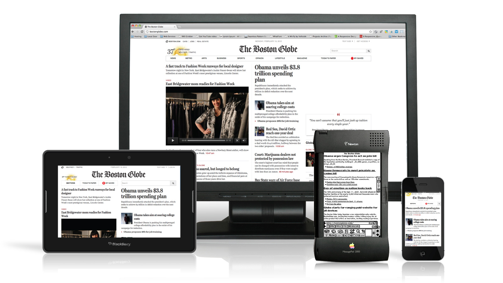
Soubor:Boston Globe responsive website, featuring Apple Newton.jpg
Z Multimediaexpo.cz
Velikost tohoto náhledu je: 800 × 450 pixelů
Obrázek ve vyšším rozlišení (rozměr: 1 600 × 900 pixelů, velikost souboru: 276 kB, MIME typ: image/jpeg)
Fotografie + Boston Globe responsive website, featuring Apple Newton (Taken on May 15, 2012)
The difference between a smartphone and a tablet was once clear, but as new device sizes and categories emerge -- such as the phablet -- the line between form factors has blurred. Though hardware may be a moving target, consumers nonetheless expect to faultlessly view Web pages regardless of the screen size, which poses a thorny challenge for Web designers.
+ pochází z Flickr.com, kde má status – Creative Commons Attribution-ShareAlike 2.0 Generic (author: Antoine Lefeuvre)
Zdroj -- http://www.flickr.com/photos/69797234@N06/7203485148
Historie souboru
Kliknutím na datum a čas se zobrazí tehdejší verze souboru.
| Datum a čas | Náhled | Rozměry | Uživatel | Komentář | |
|---|---|---|---|---|---|
| současná | 18. 1. 2014, 17:14 | | 1 600×900 (276 kB) | Sysop (diskuse | příspěvky) | (Fotografie + + pochází z Flickr.com, kde má status – Kategorie:CC fotografie Kategorie:Uživatelé FLICKRu ) |
- Editovat tento soubor v externím programu (Více informací najdete v nápovědě pro nastavení.)
Odkazy na soubor
Na soubor odkazuje tato stránka:


